Wikipedia isn’t just the largest encyclopedia in the world-it’s one of the most accessible. Millions of people rely on it every day, including those who use screen readers, navigate with keyboards, or need high-contrast text to read clearly. Behind the scenes, Wikipedia uses ARIA, proper contrast ratios, and full keyboard navigation to make sure no one gets left out. This isn’t an afterthought. It’s built into the code, tested regularly, and maintained by a community that believes knowledge should be for everyone.
ARIA Makes Dynamic Content Understandable
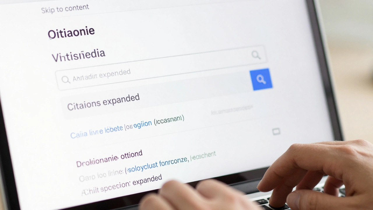
Wikipedia pages aren’t just static text. They have collapsible sections, interactive tables, search suggestions, and dynamic infoboxes that change without reloading the page. Without proper labeling, screen readers would hear nothing but silence when these elements update. That’s where ARIA-Accessible Rich Internet Applications-steps in.
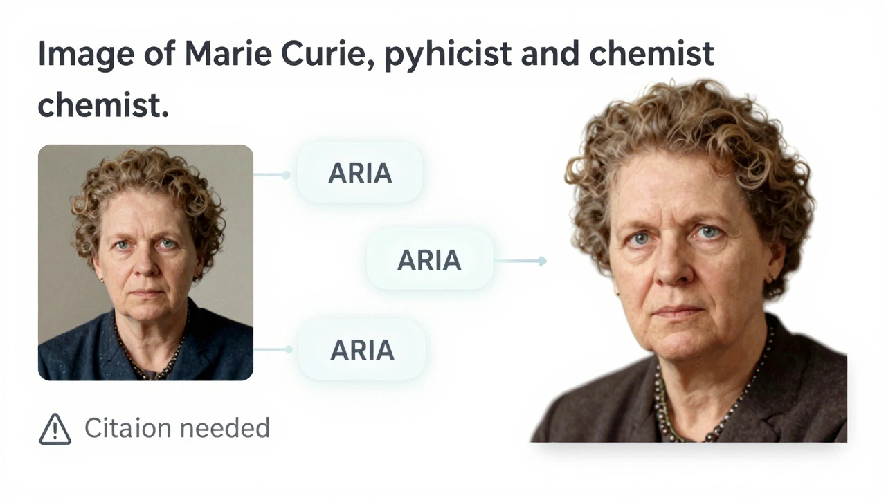
ARIA attributes like aria-expanded, aria-label, and aria-live tell assistive technologies what’s happening. For example, when you click the "Show" button under a collapsed citation list, ARIA announces, "Citations expanded," so you don’t have to guess what changed. The infobox on a person’s page uses aria-labelledby to link the image to its caption, so screen readers don’t just say "image"-they say "Image of Marie Curie, physicist and chemist."
Wikipedia doesn’t overuse ARIA. It only adds it where HTML alone isn’t enough. That’s a key principle: use native HTML first, ARIA second. A button is a <button>, not a <div> with a click handler. That’s why Wikipedia’s navigation menus, search bars, and edit tools work reliably across different screen readers like JAWS, NVDA, and VoiceOver.
Contrast Isn’t Just a Design Choice-It’s a Requirement
Text that looks fine on your monitor might be unreadable to someone with low vision, color blindness, or glare sensitivity. Wikipedia’s default color scheme isn’t flashy, but it’s carefully chosen. The main text is #333 on a #fff background. That’s a contrast ratio of 13.5:1-way above the WCAG 2.1 AA standard of 4.5:1.
Even the links stand out. They’re #0645AD, a deep blue that pops against white and remains readable under bright lights. Hover states and active links use darker shades, but never lose contrast. Wikipedia also avoids color alone to convey meaning. If a citation is missing, it doesn’t just turn red-it adds a warning icon and the word "Citation needed" in plain text.
Wikipedia’s accessibility team runs automated contrast checks on every page template. If a new theme or user script lowers contrast below 4.5:1, it gets flagged. There’s no "it looks fine to me" exception. This isn’t about aesthetics-it’s about function. A 2023 study by the Web Accessibility Initiative found that Wikipedia had the highest average contrast ratio among the top 100 websites globally.
Keyboard Navigation Works-No Mouse Required
Not everyone can use a mouse. Some people use keyboards, switch devices, or voice control. Wikipedia’s entire interface is designed to be fully navigable with just the Tab, Enter, and arrow keys.
Press Tab once, and the focus moves to the search bar. Tab again, and it lands on the main menu. Tab through the table of contents, and each section becomes clickable with Enter. Even the edit toolbar-where you bold text, insert links, or add citations-responds to keyboard shortcuts. Ctrl+B for bold, Ctrl+K for link, Alt+Shift+T for table.
There are no hidden dropdowns that only open with a mouse hover. All menus open with Enter or Space. Focus never gets stuck. If you tab past the last link on a page, the browser jumps to the footer-no infinite loops, no dead ends.
Wikipedia also includes "Skip to content" links at the top of every page. Press Tab once on a new page, and you instantly jump past the navigation, ads, and sidebars straight to the article. That saves hundreds of keystrokes for frequent users.
Real People, Real Impact
These aren’t theoretical improvements. They’re used daily by people who depend on them.
A student in rural Ohio with limited vision uses Wikipedia to study biology. She turns on high contrast mode and navigates with a keyboard. She doesn’t need a mouse to read about the Krebs cycle-she tabs through the headings, listens to the screen reader, and finds exactly what she needs.
A veteran with Parkinson’s uses voice commands to browse Wikipedia. His system clicks links and scrolls pages using speech. Because Wikipedia’s buttons have clear labels and ARIA roles, the system doesn’t misinterpret "click references" as "click refresh."
Wikipedia’s accessibility isn’t perfect, but it’s intentional. It’s updated based on user feedback. In 2024, a user reported that collapsible tables in historical timelines weren’t announcing their state. Within two weeks, the team added aria-expanded and tested it with real screen reader users. That’s how it works here: problems are reported, fixed, and verified.
What Makes Wikipedia Different
Most websites treat accessibility as a compliance checkbox. Wikipedia treats it as part of its mission. The Wikimedia Foundation’s accessibility policy is public, and anyone can contribute. There are no corporate legal teams deciding what’s "good enough." There’s a global community of volunteers-some with disabilities themselves-who test every change.
Compare that to other large sites. Many news sites hide content behind mouse-hover menus. Many e-commerce sites require a mouse to filter products. Wikipedia doesn’t do that. Its design is built for the least common denominator-not the most common.
It’s also open source. You can inspect the code. You can see how ARIA is applied. You can test keyboard navigation yourself. There’s no black box. That transparency builds trust.
How You Can Help
If you use Wikipedia regularly, you can help keep it accessible. Report issues on the MediaWiki Accessibility page. Test a page with only your keyboard. Try reading it with a screen reader. If something feels off, it probably is.
You don’t need to be a developer. If you notice a link that doesn’t announce its purpose, or a button that doesn’t respond to Enter, tell someone. The community listens.
And if you’re building a website? Use Wikipedia as a model. Start with semantic HTML. Test keyboard navigation. Check contrast ratios. Don’t add ARIA unless you need it. Keep it simple. Keep it open. Keep it for everyone.
Does Wikipedia support screen readers?
Yes. Wikipedia works with all major screen readers, including JAWS, NVDA, and VoiceOver. ARIA labels, semantic HTML, and clear page structure ensure content is announced accurately. Headings, lists, links, and interactive elements are all properly labeled so users know what they’re navigating.
What contrast ratio does Wikipedia use?
Wikipedia’s default text uses a contrast ratio of 13.5:1 (dark gray on white), which far exceeds the WCAG 2.1 AA standard of 4.5:1. Even links and buttons maintain high contrast. Automated tools scan every page to ensure no new styles reduce readability.
Can I use Wikipedia without a mouse?
Absolutely. Every feature on Wikipedia is navigable with a keyboard. Tab moves between links and controls. Enter activates buttons and links. Arrow keys navigate within tables and menus. Skip-to-content links let you bypass navigation menus instantly. No mouse is needed.
Are Wikipedia’s infoboxes accessible?
Yes. Infoboxes use ARIA roles like "region" and "article" to define their structure. Images have descriptive alt text, and data rows are marked with scope="row" so screen readers know which label goes with which value. Even collapsible sections announce their state when opened or closed.
How often does Wikipedia update its accessibility features?
Accessibility updates happen continuously. Changes are tested by volunteers with disabilities before rollout. Major fixes, like adding ARIA to collapsible tables, are completed within weeks of being reported. The community prioritizes accessibility as a core function, not a one-time audit.