Wikipedia isn't just a place to check facts-it's a living, breathing database of human knowledge updated by millions every day. For data journalists, that makes it one of the richest, most dynamic sources available. But raw text won’t tell you what’s trending, what’s connected, or what’s being ignored. You need to visualize it. And there are tools built just for that.
Why Wikipedia Data Matters for Journalists
Every minute, dozens of edits happen across Wikipedia’s 300+ language editions. These aren’t random changes. They reflect public interest, breaking news, and cultural shifts. When a new law passes, search traffic to related articles spikes. When a celebrity dies, their page gets thousands of edits in hours. When a scandal breaks, related topics suddenly gain depth and links.
Journalists who track these patterns see stories before they hit mainstream headlines. A sudden spike in edits to "climate migration" in the German Wikipedia might signal growing public concern-even if no major news outlet has covered it yet. That’s not speculation. It’s data.
Unlike social media, Wikipedia edits are public, verifiable, and structured. Every edit has a timestamp, an editor ID, and a revision history. That’s why newsrooms from The Guardian to ProPublica have started using Wikipedia data to ground their reporting in real-time public behavior.
How to Extract Wikipedia Data
You don’t need to be a coder to get started. The Wikimedia Foundation offers free APIs that let you pull edit counts, page views, and link networks. But most journalists use tools that do the heavy lifting for you.
The Wikipedia Pageviews Analysis tool lets you see how many times a page was viewed over time. You can compare multiple topics-like "vaccine efficacy" vs. "anti-vaccine movement"-and spot trends across months or years. It’s simple, free, and updated daily.
For deeper analysis, WikiWho breaks down who edited what and when. You can trace how a controversial article evolved-like which edits were reverted, which users kept making changes, and whether edits clustered around specific events. This helped journalists uncover coordinated editing campaigns during elections in several countries.
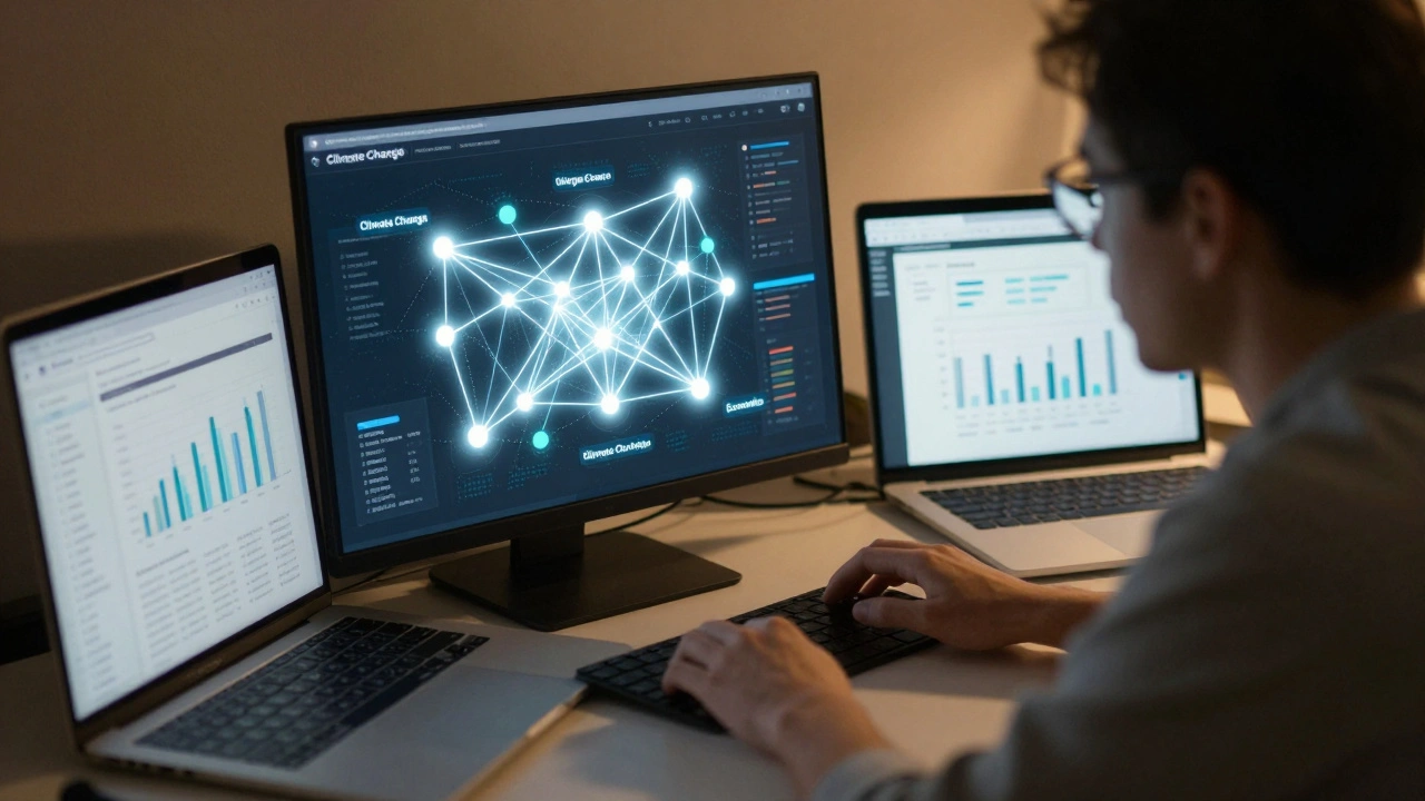
If you want to map connections between topics, WikiGraph turns Wikipedia’s internal links into visual networks. Click on "Climate Change" and you’ll see it linked to over 1,200 other articles: energy policy, migration, health, economics. Zoom out, and you get a map of how ideas are connected in the public mind.
Top Tools for Visualizing Wikipedia Topics
Here are the tools data journalists actually use-no theory, just real workflows.
- Wikipedia Pageviews Analysis: Best for tracking interest over time. Shows daily, weekly, or monthly trends. Use it to confirm if a story is gaining traction before you report on it.
- WikiWho: Ideal for investigating edit wars and bias. Shows editor identities, edit sequences, and conflict patterns. Used by Reuters to analyze how Russian state media influenced edits on Ukraine-related pages.
- WikiGraph: For mapping topic relationships. Turns Wikipedia into a knowledge web. Great for explaining complex subjects like "supply chain disruptions" by showing how they connect to labor, trade, and logistics.
- Wikidata Query Service: For structured data. Pull numbers like population, GDP, or life expectancy for hundreds of countries at once. Used by The New York Times to compare health outcomes across nations using real-time data.
- WikiCite: For sourcing. Extracts citations from Wikipedia articles to find primary sources. Helps journalists trace where claims originate and verify them.
None of these tools require coding. Most have point-and-click interfaces. You can run a query, export results to CSV, and plug them into Excel or Google Sheets in under five minutes.
Real Stories Built on Wikipedia Data
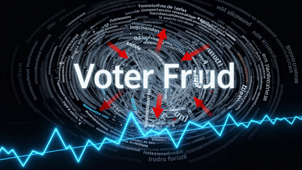
In 2023, a team at the Associated Press used Wikipedia edit patterns to track how misinformation spread during the U.S. midterm elections. They noticed a spike in edits to "voter fraud" pages in key swing states-often from the same IP addresses. Those edits were later linked to a known disinformation network. The story ran on 200+ news sites.
In Brazil, a local journalist used WikiGraph to map how the term "fake news" was increasingly linked to political opponents, not media outlets. That visual helped her explain why the phrase had lost its original meaning in public discourse.
And in Germany, reporters used WikiWho to show how a single user edited over 400 articles about the far-right party AfD, inserting biased language. The investigation led to a formal warning from Wikimedia’s oversight team.
These aren’t outliers. They’re examples of what’s possible when journalism meets open data.
What to Watch Out For
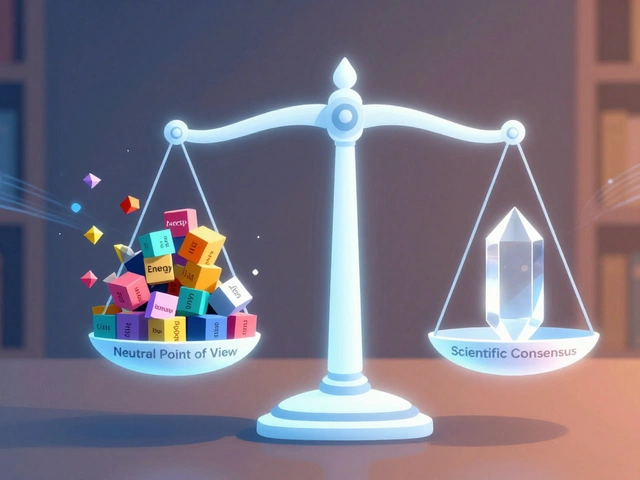
Wikipedia isn’t perfect. It’s crowdsourced, so it can be manipulated. Biases exist-especially around gender, geography, and language. English-language pages get far more attention than others. Articles on women, people of color, or Global South topics are often shorter and less linked.
Always cross-check. A spike in edits doesn’t mean a story is true-it means people are talking. Use Wikipedia as a signal, not a source. Pair it with official records, interviews, or public documents.
Also, don’t assume popularity equals importance. The most viewed page isn’t always the most relevant. A trending topic might be sensational, not substantive. Look for depth: how many links does the page have? How many editors are involved? How stable are the edits?

Getting Started: A Simple Workflow
Here’s how to begin using Wikipedia data tomorrow:
- Pick a topic you’re already reporting on-say, "student debt" or "AI regulation."
- Go to pageviews.toolforge.org and enter the article title.
- Look for spikes. Did views jump after a speech, bill, or court ruling?
- Use WikiWho to see who’s editing the page. Are the same users making repeated changes?
- Try WikiGraph to see what other topics it’s connected to. Are there unexpected links?
- Export the data. Make a simple chart. Add it to your story.
You don’t need a team. You don’t need a budget. Just curiosity and five minutes.
What’s Next for Wikipedia Journalism
Tools are getting smarter. New AI-powered systems can now detect edit patterns that suggest coordinated disinformation. Others can predict which topics are likely to trend based on early edit activity.
Some newsrooms are starting to embed Wikipedia editors as part of their reporting teams. The idea? If you’re writing about a topic, help improve the Wikipedia page. That way, your audience gets accurate info-and your reporting becomes part of the public record.
Wikipedia isn’t going away. It’s growing. And for journalists who learn to read its patterns, it’s becoming one of the most powerful tools in the toolkit.
Can I use Wikipedia data for investigative reporting?
Yes. Many major outlets have used Wikipedia edit history to uncover coordinated editing campaigns, track misinformation, and identify emerging trends. Tools like WikiWho and Pageviews Analysis provide verifiable data on who edited what and when. But always pair it with primary sources-Wikipedia shows public interest, not truth.
Do I need to know how to code to use these tools?
No. Tools like Wikipedia Pageviews Analysis, WikiGraph, and WikiCite are designed for non-programmers. You can run queries with a few clicks, export results to spreadsheets, and create charts without writing a single line of code. Some advanced features require SQL or Python, but you don’t need them to start.
Is Wikipedia data biased?
Yes, and that’s part of what makes it useful. Wikipedia reflects real-world gaps: English-language content dominates, women’s biographies are underrepresented, and Global South topics often lack depth. Recognizing these biases helps you interpret the data more accurately. A low edit count doesn’t mean a topic is unimportant-it might mean it’s underreported.
How often is Wikipedia data updated?
Page views are updated daily. Edit histories are available in near real-time-usually within minutes. Tools like WikiWho and Wikidata Query Service pull live data from Wikimedia’s servers. This makes Wikipedia one of the fastest-moving public datasets available to journalists.
Can I use Wikipedia data to predict trends?
You can spot early signals. A sudden rise in edits or page views often precedes mainstream coverage. For example, searches and edits for "long COVID" spiked months before major outlets reported on it. While you can’t predict the future, you can identify what’s gaining traction before it becomes obvious.