
Imagine trying to understand the health of a neighborhood without asking anyone how they feel. You might look at hospital admission rates or pharmacy sales, but you’d miss the quiet struggles that never make it into clinical records. This is where community health surveys come in. They are structured tools used to collect self-reported data from residents, offering a snapshot of well-being that official statistics often overlook. On platforms like Wikipedia, these surveys serve as foundational references for researchers, policymakers, and local advocates who need standardized definitions before diving into raw data.
But not all indicators are created equal. Some measure immediate risks, while others track long-term trends. If you’re digging through articles on community demographics or public health policy, knowing which metrics actually matter can save you hours of sifting through noise. Here’s what you need to know about the core indicators that define effective community health assessments.
The Core Pillars of Community Health Measurement
When you read a survey report cited in an encyclopedia entry, it usually revolves around four main pillars: physical health, mental well-being, social determinants, and access to care. These aren’t just abstract concepts; they are specific, measurable variables that tell a story about a population’s quality of life.
- Mortality and Morbidity Rates: These are the hard numbers. How many people died? What diseases are prevalent? While easy to track via vital statistics, they only reflect severe outcomes, not daily health experiences.
- Self-Reported Health Status (SRHS): This asks a simple question: "How would you rate your general health?" Surprisingly, this single question is one of the strongest predictors of future mortality and healthcare utilization. It captures the subjective feeling of being healthy, which includes factors doctors don't always see.
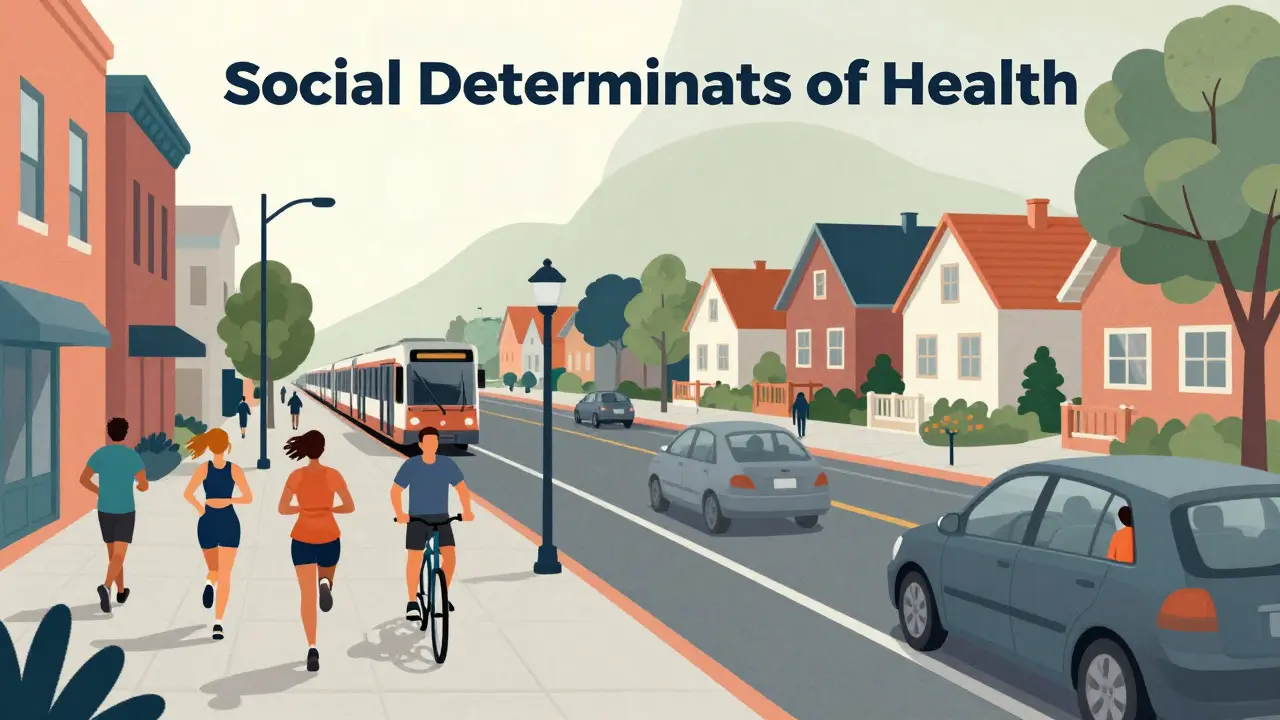
- Social Determinants of Health (SDOH): This category covers income, education, housing, and employment. Research consistently shows that where you live and work matters more than your genetic code when it comes to longevity.
- Healthcare Access Metrics: This includes insurance coverage, distance to the nearest clinic, and wait times. Without access, even good health can deteriorate quickly.
Understanding these pillars helps you interpret why two neighborhoods with similar crime rates might have vastly different health outcomes. One might have a robust primary care system, while the other relies solely on emergency rooms.
Why Self-Reported Data Changes the Picture
Official health records are great for tracking diagnoses, but they fail to capture the "in-between" state of health. A person might not be sick enough to visit a doctor but still struggle with chronic pain, fatigue, or anxiety. This is where self-reported indicators shine.
Consider the metric known as Physical Activity Levels. Public health guidelines recommend 150 minutes of moderate activity per week. However, gym memberships or step counts from smartwatches don’t tell the whole story. Survey questions about daily movement, sedentary behavior, and barriers to exercise provide a clearer picture of lifestyle habits. For instance, a resident in a car-dependent suburb might report low physical activity not due to laziness, but because their environment lacks safe walking paths.
This contextual layer is crucial. When you see a statistic on Wikipedia stating that "30% of adults in County X are physically inactive," you should ask: Is this due to lack of infrastructure, cultural norms, or economic constraints? The indicator itself is neutral, but its interpretation depends heavily on the surrounding demographic data.
Navigating Demographic Disparities in Survey Data
Raw averages can hide deep inequalities. This is why disaggregated data-breaking down results by age, race, income, and geography-is essential. Two communities might have the same average life expectancy, but one could be masking a crisis among its elderly population while the other hides youth-related health issues.
| Indicator | Young Adults (18-34) | Middle-Aged (35-64) | Seniors (65+) |
|---|---|---|---|
| Primary Concern | Mental health, injury risk | Chronic disease management | Functional limitations, isolation |
| Key Metric | Screen time, sleep quality | Blood pressure, BMI | Cognitive function, mobility |
| Data Source Reliability | High (digital natives) | Medium (mixed reporting) | Lower (recall bias) |
Notice how the "Key Metric" shifts across age groups. Focusing solely on blood pressure would miss the mental health crises affecting young adults. Conversely, ignoring cognitive decline would overlook the biggest challenge for seniors. Effective community health surveys account for these shifting priorities by using age-appropriate questions.
The Role of Social Determinants in Interpretation
You can’t talk about health without talking about money. Income inequality is one of the strongest drivers of health disparities. In community surveys, this is often measured through the Area Deprivation Index (ADI) or household income brackets. These metrics help correlate health outcomes with economic stability.
For example, food insecurity isn’t just about hunger; it’s about nutritional quality. A survey might reveal that 15% of households in a specific zip code skip meals to save money. This indicator directly links to higher rates of diabetes and hypertension. When reading Wikipedia entries on local health profiles, look for these cross-references. If an article lists high diabetes rates but doesn’t mention food access or grocery store proximity, the analysis is incomplete.
Education level also plays a critical role. Higher educational attainment correlates with better health literacy, meaning residents are more likely to understand preventive care, navigate complex medical systems, and adhere to treatment plans. Surveys often include education as a control variable to isolate the true impact of healthcare interventions.

Common Pitfalls in Reading Survey-Based Articles
Even reputable sources can mislead if you don’t know what to look for. Here are three common traps to avoid when analyzing community health data presented in encyclopedic formats:
- Ignoring Sample Size: A small sample from a rural town may not represent the broader region. Always check if the survey had enough participants to draw reliable conclusions.
- Confusing Correlation with Causation: Just because two things happen together doesn’t mean one causes the other. High stress levels and poor diet often coexist, but one doesn’t automatically cause the other without behavioral context.
- Outdated Benchmarks: Health standards evolve. What was considered a normal BMI ten years ago might be viewed differently today. Ensure the indicators used align with current public health guidelines.
Being aware of these pitfalls helps you move from passive reading to active critical analysis. You start asking better questions: Who was surveyed? How were they selected? What questions were asked?
Practical Applications for Local Advocates
So, how do you use this information? If you’re involved in local advocacy, community planning, or public health research, these indicators are your toolkit. They allow you to identify gaps in services and target resources where they’re needed most.
For instance, if a survey shows high rates of asthma in a specific neighborhood, you might investigate air quality data, indoor mold exposure, or proximity to industrial zones. The health indicator points to the problem; the environmental data provides the solution path. This linkage between health metrics and environmental factors is a key aspect of modern public health strategy.
Additionally, tracking changes over time is vital. A single survey is a snapshot. Annual or biennial surveys allow you to measure progress. Have asthma rates dropped after new regulations? Has mental health access improved after a new clinic opened? Longitudinal data transforms static numbers into dynamic stories of change.
What is the most important indicator in a community health survey?
There is no single "most important" indicator, but Self-Reported Health Status (SRHS) is often considered the most powerful predictor of overall well-being and future healthcare costs. It captures the holistic view of health that clinical data misses.
How does Wikipedia use community health survey data?
Wikipedia typically uses survey data to provide context for demographic and geographic articles. It cites major studies to define local health profiles, highlight disparities, and reference standard methodologies used in public health research.
What are Social Determinants of Health (SDOH)?
SDOH are the conditions in which people are born, grow, live, work, and age. They include factors like income, education, housing, and job security, which significantly influence health outcomes beyond genetics and healthcare access.
Why is self-reported data sometimes less reliable than clinical data?
Self-reported data is subject to recall bias and social desirability bias. People may forget details or answer in ways they think are expected. However, it remains invaluable for capturing subjective experiences and behaviors that clinical records don't track.
How can I find reliable community health survey data for my area?
Look for data from local health departments, university research centers, or national organizations like the CDC. Cross-reference findings from multiple sources to ensure accuracy and check the methodology section of any published reports.