When you open The Signpost on English Wikipedia, you’re not just reading a newsletter. You’re stepping into the living room of a global volunteer community that runs one of the world’s largest knowledge projects. It’s not polished like a corporate magazine. It doesn’t chase clicks. It’s messy, opinionated, and oddly human - and that’s exactly why it works.
Why The Signpost Exists
The Signpost started in January 2005 as a simple mailing list update. Today, it’s a weekly online newspaper written entirely by volunteers, for volunteers. It covers edits that made headlines, disputes that spilled into the open, policy changes that reshaped how content is moderated, and the people behind the usernames.
Unlike traditional news outlets, The Signpost doesn’t report on Wikipedia from the outside. It reports from within. Its reporters are editors who’ve spent hundreds of hours on talk pages, arbitration committees, and deletion debates. They know the difference between a vandalism spree and a well-intentioned edit war. They understand why a 200-word summary on a minor actor might trigger a 300-comment thread.
Its existence proves something important: Wikipedia isn’t just a database. It’s a society. And like any society, it needs a public square to talk about itself.
The Layout: Functional, Not Fancy
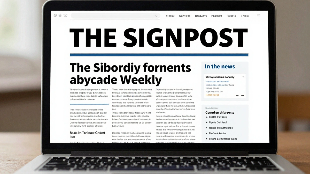
The layout of The Signpost hasn’t changed much in 15 years - and that’s by design. It uses a clean, single-column structure with bold headlines, short paragraphs, and minimal styling. There are no sidebars. No ads. No autoplay videos. No newsletter signup pop-ups.
Why? Because its readers aren’t looking for entertainment. They’re looking for context. An editor checking The Signpost on a Sunday morning wants to know: What happened last week that I missed? Who’s being blocked? What policy just changed? The layout removes distractions so that information lands fast.
Each issue follows a predictable pattern:
- A short editorial from the editor-in-chief
- “In the news” - major events affecting Wikipedia
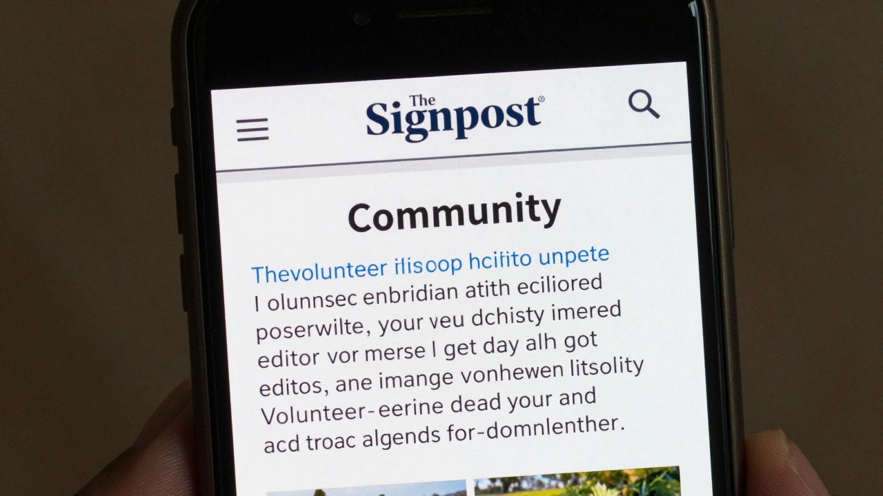
- “Community” - human-interest stories about editors
- “Traffic” - articles that got a surge in views
- “Obituaries” - remembering deceased contributors
- “Opinion” - editorials from the community
- “Behind the scenes” - technical or administrative updates
This structure isn’t arbitrary. It’s built around the real needs of active editors. If you’re someone who spends 10 hours a week patrolling recent changes, you don’t need fluff. You need the facts, fast.
Typography and Readability
The Signpost uses a standard sans-serif font - usually Arial or Helvetica - at 14-16 pixel size. Headlines are bold and all-caps. Subheadings are lowercase with a slight margin. There’s no italicization for emphasis. No underlining. No color coding.
This isn’t a design choice made by a graphic designer. It’s a choice made by people who edit on old laptops, on mobile phones in rural areas, and on library computers with slow connections. The goal isn’t beauty. It’s accessibility.
Studies from the Wikimedia Foundation show that 40% of active Wikipedia editors use mobile devices to contribute. The Signpost’s layout works on a 2012 Android phone as well as a 2025 MacBook. That consistency matters. If the layout broke on a tablet, editors in Nigeria or Indonesia might miss critical updates.
How Articles Are Structured
Each article in The Signpost follows a simple template:
- One clear headline that states the event or issue
- A single paragraph summarizing what happened
- Quotes or links to relevant discussions (always linked to Wikipedia pages)
- Context: Why this matters to the community
- What’s next - if anything
There are no long intros. No backstories. No “imagine a world where…”
Take this headline from a 2024 issue: “Arbitration Committee bans user for coordinated editing campaign”. The article that follows is 327 words. It names the user, cites the policy violated, links to the arbitration case, and explains the impact on article neutrality. That’s it.
Compare that to a mainstream news outlet covering the same event. It might take 1,200 words to explain the “bigger picture.” The Signpost assumes you already know the bigger picture. You’re part of it.
The Role of Images and Media
Images are rare in The Signpost. When used, they’re almost always screenshots of Wikipedia edits, diff pages, or community banners. No stock photos. No portraits of editors unless they’re public figures like Jimmy Wales.
Why? Because the focus is on actions, not personalities. A screenshot of a deleted article’s talk page tells you more than a photo of the editor who wrote it. It shows the conflict, the tone, the process.
There’s one exception: obituaries. When a long-time editor passes away, The Signpost sometimes includes a photo - if the family gives permission. Those are the only moments where emotion is allowed to show through the design.
Color and Branding
The Signpost uses only two colors: black text on white background, with blue links. That’s it. No green highlights. No red warnings. No yellow callouts.
This minimalism reflects Wikipedia’s core philosophy: neutrality. Color implies bias. A red box says “danger.” A green box says “good.” The Signpost avoids that entirely. It lets the facts speak.
The logo - a simple black-and-white newspaper header with the word “Signpost” - hasn’t changed since 2005. It’s not trendy. It’s not modernized. It’s consistent. That consistency builds trust. Readers know what to expect. If you’ve read one issue, you know how to read them all.
Why It Doesn’t Look Like a Modern Newsletter
Most online newsletters today are designed for engagement: bold headers, pull quotes, embedded videos, social share buttons, email opt-ins. The Signpost does none of that.
It doesn’t need to. Its audience isn’t passive. It’s active. Readers don’t click “like.” They edit. They comment. They start debates on talk pages. The Signpost isn’t meant to be consumed - it’s meant to be acted upon.
Its design signals: This isn’t for you to admire. It’s for you to use.
The Impact of Design on Participation
There’s a direct link between The Signpost’s layout and community health. A 2023 analysis by Wikimedia Research found that editors who read The Signpost regularly were 37% more likely to participate in policy discussions and 29% more likely to join arbitration cases.
Why? Because the layout makes complex issues feel approachable. When you see a clear, plain-English summary of a 500-comment dispute, you don’t feel overwhelmed. You feel informed. And that’s the first step toward action.
Compare that to a dense, jargon-heavy arbitration report. Most editors skip it. The Signpost turns that report into something a new editor can understand in five minutes.
What Could Change - and What Shouldn’t
There’s been talk over the years about redesigning The Signpost. Some suggest a dark mode. Others want a mobile app. A few have proposed interactive timelines for major disputes.
But the community has resisted. Why? Because change risks breaking trust. The Signpost’s power comes from its reliability. If it suddenly looked like a BuzzFeed quiz, editors might stop taking it seriously.
Small improvements have been made - like better mobile responsiveness in 2021 - but the soul remains untouched. The layout is a reflection of Wikipedia’s values: open, transparent, and focused on substance over style.
What You Can Learn From It
If you run a community-driven project - whether it’s a forum, a fan wiki, or an open-source team - The Signpost offers a blueprint. You don’t need fancy tools to build trust. You need clarity, consistency, and respect for your audience’s time.
Here’s what works:
- Use simple structure - predictable sections build habit
- Write like you’re talking to someone who already knows the basics
- Avoid visual noise - it distracts from the message
- Let facts lead, not emotions
- Don’t chase trends. Chase reliability.
The Signpost doesn’t try to be the future of news. It’s the present of community. And in a world full of algorithms and attention grabs, that’s more valuable than ever.
Why doesn’t The Signpost use color or images like other newsletters?
The Signpost avoids color and images to stay neutral and accessible. Color can imply bias, and images add loading time - both of which go against Wikipedia’s core values of neutrality and accessibility. Its audience values clear, fast information over visual appeal.
Who writes The Signpost?
The Signpost is written entirely by volunteer Wikipedia editors. Contributors are not paid and are selected based on their experience, writing clarity, and understanding of Wikipedia’s policies. The editor-in-chief is elected annually by the community.
How often is The Signpost published?
The Signpost is published weekly, every Sunday. Each issue covers events from the previous week, including major edits, policy changes, community disputes, and editor milestones.
Can anyone contribute to The Signpost?
Yes. Any registered Wikipedia editor can propose an article idea or submit a draft through the Signpost’s submission page. Contributions are reviewed by the editorial team for accuracy, tone, and relevance to the community.
Is The Signpost archived?
Yes. All issues since 2005 are archived on Wikipedia and are fully searchable. The archive is a key resource for researchers studying online communities, digital governance, and collaborative editing.
If you’re trying to build a community that lasts, look at The Signpost. Not for its design. For its discipline. It doesn’t try to impress. It just shows up - every week - with the facts, the context, and the respect its readers deserve.