For nearly two decades, the look of Wikipedia was a constant. The white background, the blue links, the cluttered sidebar-it was the digital equivalent of a library card catalog: functional, dated, and familiar. But in 2026, that familiarity is gone. The recent Desktop Improvements project represents the most significant visual and structural shift for the platform since its inception. If you’ve opened a browser tab recently and felt disoriented by the new layout, you’re not alone. This isn’t just a cosmetic update; it’s a fundamental rethinking of how millions of users access human knowledge on large screens.
The Core Problem: Usability in the Modern Browser
Why change what works? The short answer is that it stopped working for modern devices. The original Wikipedia interface was designed in an era when screen resolutions were low and bandwidth was precious. Today, we use laptops with high-DPI displays, tablets in landscape mode, and desktop monitors that stretch across entire desks. The old design didn’t scale well. Text became too small to read comfortably without zooming, and the navigation menu often overlapped content or disappeared entirely on smaller laptop screens.
The primary goal of the overhaul was to improve web accessibility and readability. By increasing font sizes and adjusting line spacing, the reading experience now feels less like scanning a dense academic paper and more like reading a well-formatted article. For students, researchers, and casual readers alike, this reduces eye strain and makes long-form content easier to digest. It’s a subtle but powerful shift that prioritizes the user’s comfort over rigid adherence to legacy code.
What Actually Changed in the Layout
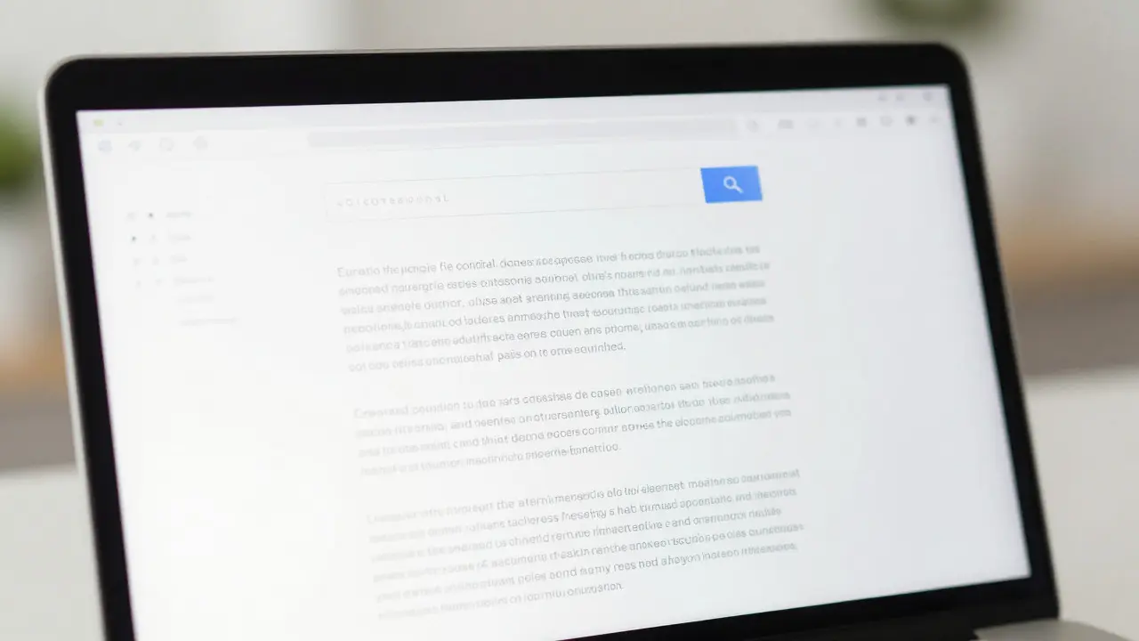
If you compare the old and new interfaces side-by-side, three major changes stand out immediately. First, the header has been streamlined. The search bar is now more prominent and centered, reflecting its status as the primary tool for most visitors. Second, the navigation sidebar has been collapsed into a cleaner, more compact menu. Instead of a long list of links taking up valuable horizontal space, these options are tucked away until needed, freeing up the main column for content.
Third, and perhaps most controversially, the placement of infoboxes (the summary boxes with images and key facts) has been adjusted. On mobile devices, they already appeared at the top. Now, on desktops, they follow a similar logic, ensuring that the most critical information is visible before the user scrolls. This change aligns the desktop experience with the mobile-first design philosophy that dominates modern web development.
| Feature | Legacy Interface (Pre-2025) | New Interface (2026) |
|---|---|---|
| Font Size & Spacing | Smaller fonts, tighter line height | Larger base font, increased line height for readability |
| Navigation Menu | Permanent, wide sidebar consuming space | Collapsible, compact menu; content-first layout |
| Search Bar | Top-left corner, smaller input field | Centered, larger input field for better visibility |
| Infobox Placement | Right-aligned, sometimes overlapping text | Top-aligned or responsive flow, no overlap |
| Dark Mode Support | Basic system-level only | Enhanced contrast ratios, optimized color palette |
The Role of Community Feedback
This wasn’t a top-down decision made in a vacuum. The Wikimedia Foundation spent years gathering data from user behavior analytics. They tracked where users clicked, where they scrolled, and where they dropped off. The data showed that many users ignored the sidebar entirely, while others struggled to find specific tools like "Edit" or "Talk" pages.
To validate their assumptions, the team ran A/B tests with thousands of volunteers. These tests measured task completion rates-how quickly could a user find a specific fact, or how easily could they make a minor edit? The results were clear: the new layout reduced the time-to-information by an average of 15% for common queries. However, the transition wasn’t without friction. Long-time editors, who relied on muscle memory to navigate the old interface, reported initial confusion. This highlights a classic challenge in UX design: balancing efficiency for new users with familiarity for power users.
Technical Infrastructure Behind the Change
Beneath the surface, the interface overhaul required significant work on MediaWiki, the software engine that powers Wikipedia. MediaWiki is a PHP-based application framework that has evolved slowly over the years to maintain stability. Updating the front-end meant refactoring large portions of the CSS and JavaScript codebase to ensure compatibility with modern browsers.
Performance was a key concern. A heavier interface could slow down page loads, especially for users in regions with slower internet connections. To mitigate this, developers optimized asset loading and implemented lazy-loading techniques for non-critical elements. The result is an interface that looks more modern but remains lightweight enough to load quickly even on mid-range hardware. This balance between aesthetics and performance is crucial for a site that serves billions of requests daily.
Impact on Editing and Contribution
Wikipedia isn’t just for reading; it’s for writing. The new interface affects how contributors interact with the platform. The "Edit" button, previously buried in the sidebar, is now more accessible, often appearing directly next to section headings. This lowers the barrier to entry for first-time editors, encouraging more people to fix typos or add citations.
However, advanced features like VisualEditor remain slightly hidden to keep the interface clean. Power users can still access them, but the default view prioritizes simplicity. This strategy aims to grow the contributor base by making the initial steps easier, even if it requires a slight learning curve for those accustomed to the old deep-menu structure. The hope is that a larger pool of casual editors will eventually lead to a more robust and diverse knowledge base.
Adapting to the New Normal
If you’re struggling with the new layout, here are a few quick tips to get comfortable:
- Use Keyboard Shortcuts: Pressing '/' focuses the search bar instantly, saving you from hunting for the mouse.
- Customize Your View: Most browsers allow you to adjust zoom levels. If the text feels too large, try setting your default zoom to 90%.
- Explore the Hamburger Menu: The three-line icon usually hides the navigation links. Hovering over it reveals the same options as the old sidebar.
- Check Dark Mode Settings: Ensure your OS dark mode is synced with the browser for the best contrast experience in low-light environments.
The desktop improvements mark a new chapter for one of the world’s largest collaborative projects. By listening to user feedback and leveraging modern web standards, the Wikimedia Foundation has created an interface that is not only prettier but genuinely more useful. As you explore the updated site, take note of how the changes affect your research workflow. Whether you’re a student writing a paper or a hobbyist editing a niche topic, this new environment is designed to help you find and share knowledge with less friction.
Is the new Wikipedia interface mandatory?
Yes, for most users, the new interface is the default. However, some advanced settings in your account preferences may allow you to revert to older styles temporarily, though support for the legacy view is gradually being phased out.
Did the redesign change how articles are structured?
No, the internal structure of articles (headings, sections, references) remains the same. The change is purely in the presentation layer-the CSS and HTML wrapper that displays the content. The underlying data model in MediaWiki was not altered.
Why did Wikipedia increase the font size?
User testing showed that the previous font size was difficult to read on high-resolution screens without zooming. Increasing the base font size improves readability and reduces cognitive load for users reading long articles.
How does the new layout affect mobile users?
Mobile users saw earlier versions of these improvements. The desktop update aligns the large-screen experience with the mobile-first approach, ensuring consistency across devices. Mobile layouts remain optimized for touch interactions and narrow viewports.
Can I customize the new interface further?
Yes, through browser extensions or custom CSS in your user preferences, you can still tweak colors, fonts, and spacing. The core layout is fixed, but the styling remains flexible for personal preference.