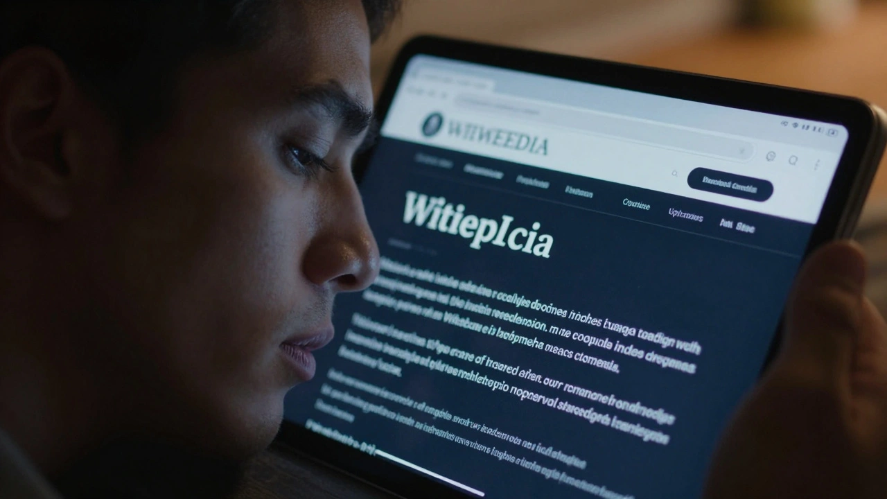
When we talk about Wikipedia accessibility, we aren't just chatting about a toggle for a dark theme. We're talking about the fundamental right to access human knowledge regardless of visual, motor, or cognitive abilities. From the way a screen reader handles complex tables to how a high-contrast mode helps someone with low vision, the interface design of the world's largest encyclopedia has a massive impact on who can actually use it.
Key Takeaways
- Dark mode reduces glare and helps users with photophobia or visual fatigue.
- WCAG 2.1 standards drive the shift toward better color contrast and keyboard navigation.
- Screen reader compatibility depends heavily on semantic HTML and ARIA labels.
- Custom CSS and browser extensions can bridge the gap where native settings fall short.
The Real Impact of Dark Mode
Most of us think of dark mode as a "cool" aesthetic choice, but for people with certain visual sensitivities, it's a necessity. Dark Mode is a low-light user interface option that reverses the traditional color palette, using light-colored text on a dark background. This isn't just about saving battery on an OLED screen; it's about reducing "halation," where bright light bleeds over the edges of text for people with astigmatism.
In the context of Wikipedia, the shift to a dark-themed interface helps users with photophobia-a condition where light triggers pain or discomfort. Imagine trying to research the French Revolution while your eyes are physically reacting to the brightness of the screen. By flipping the contrast, the cognitive load drops, and the user can focus on the information rather than the pain of the interface. However, it's not a one-size-fits-all solution. Some users with certain types of dyslexia find that light-on-dark text actually makes reading harder, which is why having multiple theme options is the gold standard for accessibility.
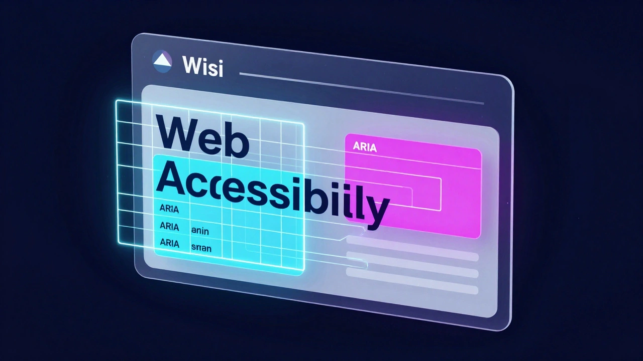
Meeting the Gold Standard: WCAG 2.1
To keep things consistent, Wikipedia and other major platforms lean on the Web Content Accessibility Guidelines (also known as WCAG) is a set of international standards developed by the W3C to make web content more accessible to people with disabilities. Specifically, WCAG 2.1 focuses on color contrast ratios. For standard text, the rule of thumb is a contrast ratio of at least 4.5:1.
Why does this matter for a wiki? Think about those tiny blue links. If the blue is too light against a white background, or too dark against a charcoal background, it becomes invisible to someone with color blindness. The goal is to ensure that the visual hierarchy remains clear. If a user can't tell the difference between a heading and a paragraph because the colors are too similar, the entire structure of the page collapses for them.
| Requirement | WCAG Level AA Standard | Impact on User |
|---|---|---|
| Text Contrast | 4.5:1 (Standard Text) | Ensures readability for low-vision users |
| Non-text Contrast | 3:1 (UI Components) | Helps identify buttons and input fields |
| Focus Indicator | Visible contrast change | Crucial for keyboard-only navigation |
Navigating Without a Mouse
For someone using a Screen Reader, which is software that converts text on a screen into spoken words or braille, the visual look of the site is secondary to its underlying structure. The biggest hurdle in Wikipedia's interface has always been the complexity of its tables and infoboxes. If the HTML isn't semantic-meaning the code tells the browser exactly what is a header and what is a cell-the screen reader just reads a random string of numbers and names.
A huge part of the accessibility puzzle involves ARIA (Accessible Rich Internet Applications), a set of attributes added to HTML to provide extra context to assistive technologies. For example, when you click a "Edit" button on a section, an ARIA label can tell the user exactly which section they are about to modify, rather than just saying "Button 14." This prevents the "lost in space" feeling that often happens when navigating dense, information-heavy pages.
The Role of Community-Driven Tweaks
Wikipedia is unique because its users can actually change how the site looks via CSS (Cascading Style Sheets), the language used to describe the presentation of a document written in HTML. Many power users utilize the "Custom CSS" field in their preferences to implement accessibility fixes that the official developers haven't rolled out yet. This might include increasing the base font size from 14px to 18px or adding a specific high-contrast border around active elements.
Outside of the site's internal settings, browser extensions like Dark Reader provide a necessary bridge. These tools don't just invert colors; they analyze the page to ensure that images don't look like ghostly negatives and that text remains legible. This is a great example of a "user-side" fix that addresses the gap between a standard interface and a truly accessible one.
Cognitive Accessibility and Layout
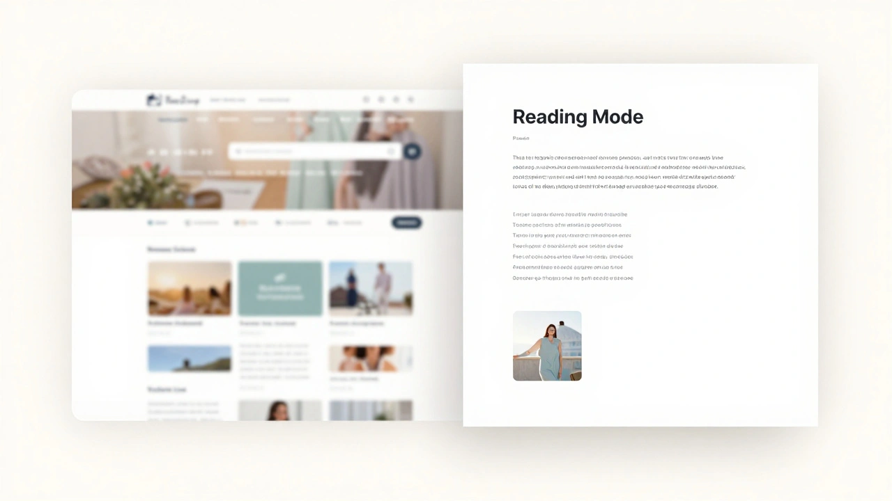
Accessibility isn't only about sight and hearing; it's also about how our brains process information. For people with ADHD or autism, the sheer amount of clutter on a Wikipedia page-the sidebars, the banners, the dense citations-can be overwhelming. This is where "Reading Mode" becomes a lifesaver. By stripping away everything but the core text and images, the interface reduces cognitive load.
Modern Wikipedia interfaces are moving toward a more modular design. Instead of one giant page, they're experimenting with collapsible sections and simplified views. This allows users to control the flow of information, which is a key part of Cognitive Accessibility. When you can hide the noise, the actual knowledge becomes the focus again.
How do I enable dark mode on Wikipedia?
Depending on your version (Vector 2022 or legacy), you can usually find the appearance settings in the "Preferences" menu under the "Appearance" tab. If the native option isn't available for your specific skin, browser extensions like Dark Reader are the most reliable alternative.
Does dark mode actually help with accessibility?
Yes, specifically for users with photophobia, certain types of cataracts, or severe astigmatism. It reduces the glare and contrast-related eye strain, making long-form reading possible for those who find bright white backgrounds painful.
What is a screen reader and how does it work with Wikipedia?
A screen reader is software that reads the text of a webpage aloud. It relies on the site's HTML structure (like headings and lists) to navigate. Wikipedia uses semantic HTML and ARIA labels to help these tools tell the user where they are on the page.
What are the most important WCAG standards for reading sites?
The most critical standards include a minimum contrast ratio of 4.5:1 for text, ensuring all interactive elements are keyboard-accessible, and providing text alternatives (alt-text) for all meaningful images.
Can I customize Wikipedia's font for better readability?
Yes, registered users can add custom CSS to their account preferences. This allows you to change fonts to something more readable (like OpenDyslexic) or adjust the line-height and letter-spacing to suit your needs.
Next Steps for a Better Experience
If you find the default Wikipedia interface limiting, start by checking your account preferences. If you're a registered editor, dive into the CSS customization to create a layout that works for your specific needs. For those without an account, exploring your browser's built-in "Reader View" is the fastest way to remove distractions.
For developers and editors, the goal should always be adding descriptive alt-text to images and using proper header levels (H1, H2, H3). Every time an editor replaces a vague link like "click here" with a descriptive one like "Read more about the Industrial Revolution," they are making the site more accessible for everyone using assistive technology.
