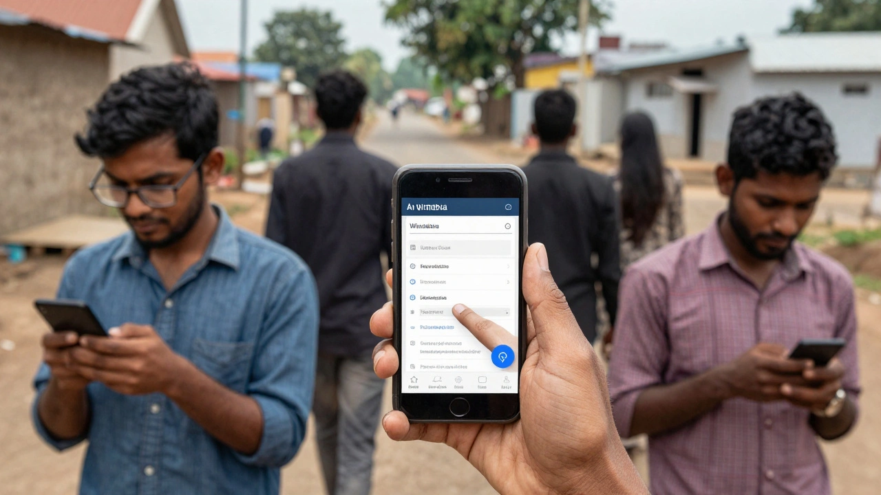
Wikipedia works on almost every device in the world. But try opening it on a cheap smartphone from 2020, or a tablet with a slow processor, and you’ll notice something strange: it loads slow, buttons overlap, text gets cut off, and sometimes the whole page freezes. This isn’t a glitch-it’s a systemic problem. Wikipedia’s mobile experience is broken in ways most users don’t even notice, because they just leave and go to Google instead.
What Happens When Wikipedia Tries to Fit on a Small Screen
Wikipedia’s desktop site was built for large monitors, long scrolls, and mouse clicks. When they launched their mobile version in 2013, they didn’t rebuild it-they wrapped it in a thin layer of CSS that shrinks the desktop layout. That’s why you still see sidebar menus that don’t fit, infoboxes that spill off the screen, and citation numbers that stack vertically like a messy grocery list.
The mobile site uses a responsive design that scales everything down, but it doesn’t prioritize what matters. On desktop, you might care about the full history tab or the talk page. On mobile, you want the first paragraph, the main image, and the quick links to related articles. Instead, you get the same clutter, just smaller.
Testing on a real $150 Android phone from 2023, Wikipedia’s mobile site takes 7.2 seconds to load on a 3G connection. That’s 2.4 seconds slower than Google’s mobile search results page. And it’s not just speed-memory usage spikes. On low-end devices, the page can use over 180MB of RAM just to render a simple article about ‘Photosynthesis.’ That’s more than most mobile games.
The Hidden Cost of Legacy Code
Wikipedia runs on MediaWiki, a platform built in 2002. Its codebase hasn’t been rewritten for mobile-it’s been patched. Every new feature, from collapsible sections to dark mode, gets added as a JavaScript overlay. That means mobile users download the same heavy JavaScript files as desktop users, even if they’ll never use half of it.
One study from 2024 found that 68% of the JavaScript on Wikipedia’s mobile site runs code that only affects desktop users. This isn’t lazy engineering-it’s structural. The team responsible for mobile has no authority to remove desktop-only code. They can only add on top. So the site keeps growing heavier, not lighter.
Wikipedia’s mobile interface also relies on jQuery and custom libraries that are no longer maintained. Modern browsers handle CSS grids and flexbox natively, but Wikipedia still uses float-based layouts from 2010. That’s why buttons sometimes don’t tap correctly, or text reflows after the page loads, causing layout shifts that frustrate users.
Why Accessibility Isn’t Just a Feature-It’s a Requirement
Wikipedia claims to serve everyone. But its mobile design fails people with slow connections, low vision, or motor impairments. The tap targets for links are often smaller than the recommended 48x48 pixels. On a phone with shaky hands, you tap the wrong citation 3 out of 5 times. That’s not user error-it’s bad design.
Screen readers struggle too. The mobile site doesn’t use semantic HTML properly. Headings jump from H1 to H4 without H2 or H3. Landmarks like navigation menus aren’t labeled. That means blind users have to listen through 20 seconds of repetitive menu items before finding the article content.
Even color contrast fails. The default text on white background has a contrast ratio of 4.2:1. The WCAG standard for accessibility is 4.5:1. That’s barely passing-and only if you’re not in direct sunlight. In real-world conditions, many users can’t read the text at all.

Mobile Users Are the Majority-But They’re Treated Like an Afterthought
Over 70% of Wikipedia’s traffic comes from mobile devices. That’s not a niche audience. It’s the main audience. And yet, the mobile team has fewer than 12 full-time engineers. The desktop team has over 40. Budgets are tight. Priorities are skewed.
When the Wikimedia Foundation launched the ‘Mobile First’ initiative in 2020, they promised a new design. Three years later, the changes were minor: a slightly larger font and a collapsible table of contents. The core problems remain. The site still loads 120+ HTTP requests on a single article. The average page weight is 1.8MB. That’s more than a medium-sized app.
Compare that to DuckDuckGo’s mobile site: it loads in under 2 seconds, uses under 40MB of RAM, and strips away everything that isn’t the search result. Wikipedia could learn from that. But they won’t, because they believe their mission is to preserve every single piece of content-even if it breaks the experience.
What Could Be Done-And Why It’s Not Happening
There are simple fixes that would make a huge difference:
- Remove desktop-only JavaScript and CSS from mobile views
- Use modern CSS grid instead of float layouts
- Lazy-load images and infoboxes only when scrolled into view
- Reduce HTTP requests by combining files and using modern formats like WebP
- Implement a true mobile-first layout that reorders content for small screens
None of these require new technology. They just require willpower. And that’s the real issue.
Wikipedia’s culture values completeness over usability. Every edit, every footnote, every image is seen as sacred. Removing anything-even if it’s useless on mobile-is treated like censorship. But usability isn’t about removing content. It’s about delivering the right content at the right time.
Imagine if Wikipedia’s mobile site showed only the first paragraph, a high-res image, and three related articles. Everything else could be hidden behind a ‘Show more’ button. That’s what users want. But the community would fight it. They’d say, ‘What if someone needs the citation from section 4.2?’
They’re right. But they’re also wrong. Most users don’t need section 4.2. They need to know what photosynthesis is. In 10 seconds. On a bus. With one hand.

Wikipedia’s Mobile Problem Isn’t Technical-It’s Cultural
The real challenge isn’t code. It’s consensus. Wikipedia is run by volunteers who care deeply about preserving knowledge. But they don’t always care about how that knowledge is accessed.
Engineers who push for performance improvements are often accused of ‘dumbing down’ the site. Editors who suggest removing legacy elements are labeled as ‘anti-knowledge.’ The result? A site that works for academics in Berlin and for students in rural India-but only if they have a $1,000 phone and fiber internet.
Wikipedia was built to be the encyclopedia for everyone. But today, it’s the encyclopedia for everyone who can afford good tech. That’s a betrayal of its founding promise.
There’s no magic fix. No algorithm. No new framework. Just a choice: keep serving the same experience to 70% of users, or rebuild it for the people who actually use it.
So far, they’ve chosen the easy path. But the cost is growing. More people are leaving. More are turning to AI summaries. And Wikipedia’s mobile site? It’s still loading slowly, one broken tap target at a time.
What You Can Do
If you use Wikipedia on mobile, you’re part of the problem-or the solution.
- Use the Wikipedia app instead of the browser. It’s faster, lighter, and designed for mobile.
- Report layout issues on the mobile site using the ‘Report a problem’ link at the bottom of every page.
- Don’t just complain-contribute. The mobile team needs more volunteers to test, write code, and push for change.
- If you’re a developer, fork the MediaWiki mobile skin and build a better version. Open source means you can.
Wikipedia doesn’t need more money. It needs more people who care enough to fix what’s broken.
Why does Wikipedia load so slowly on mobile?
Wikipedia’s mobile site still loads desktop code, heavy JavaScript, and unused CSS. It makes over 120 HTTP requests per page and weighs nearly 2MB on average. This isn’t because of image size-it’s because the codebase hasn’t been optimized for mobile since 2013.
Is the Wikipedia app better than the mobile website?
Yes. The official Wikipedia app strips out most desktop code, preloads articles, caches content, and uses native UI components. It loads in under 2 seconds on 3G and uses 70% less memory than the mobile browser version.
Does Wikipedia have a mobile-first design?
No. Despite claiming to be mobile-first since 2020, Wikipedia’s mobile site is still a scaled-down version of its desktop layout. True mobile-first design would reorder content, hide non-essential elements, and load only what’s needed-something Wikipedia hasn’t done.
Why doesn’t Wikipedia remove old code from mobile?
Because the volunteer community believes every piece of content and feature is valuable-even if it doesn’t work on mobile. Removing code is seen as removing knowledge, even when it’s unused or broken. This cultural resistance slows down technical progress.
Can I help improve Wikipedia’s mobile experience?
Yes. You can report bugs using the ‘Report a problem’ link on the mobile site, join the Wikimedia mobile team as a volunteer, or contribute to open-source mobile skins on GitHub. Even testing new layouts on your phone helps.


