Ever noticed that the look of Wikipedia is no longer the same as it was five years ago? The shift from the classic "Vector" layout to newer interfaces like "Vector 2022" and the rise of customizable visual themes or skins that allow users to adjust font size, color schemes, and layout density has sparked a lot of debate among editors and readers alike. As of mid-2026, the platform is in a transitional phase where legacy preferences are being phased out, but new customization options are emerging to meet modern accessibility standards.
This isn't just about aesthetics. The way you interact with the encyclopedia-how easily you can find edit buttons, how fast pages load on mobile devices, and whether the text is readable for people with visual impairments-depends heavily on these underlying structural changes. If you're an editor who misses the old sidebar or a reader who wants a cleaner experience, understanding what's changing and why is crucial for staying comfortable on the site.
The Evolution of Wikipedia Interfaces
To understand the current state of affairs, we have to look at the history of MediaWiki, the software that powers Wikipedia and thousands of other wikis. For over a decade, the default skin was simply called "Vector." It was functional, stable, and familiar. However, by the early 2020s, it had become outdated. The left-hand sidebar took up valuable screen real estate, especially on smaller screens, and the typography wasn't optimized for long-form reading on high-resolution displays.
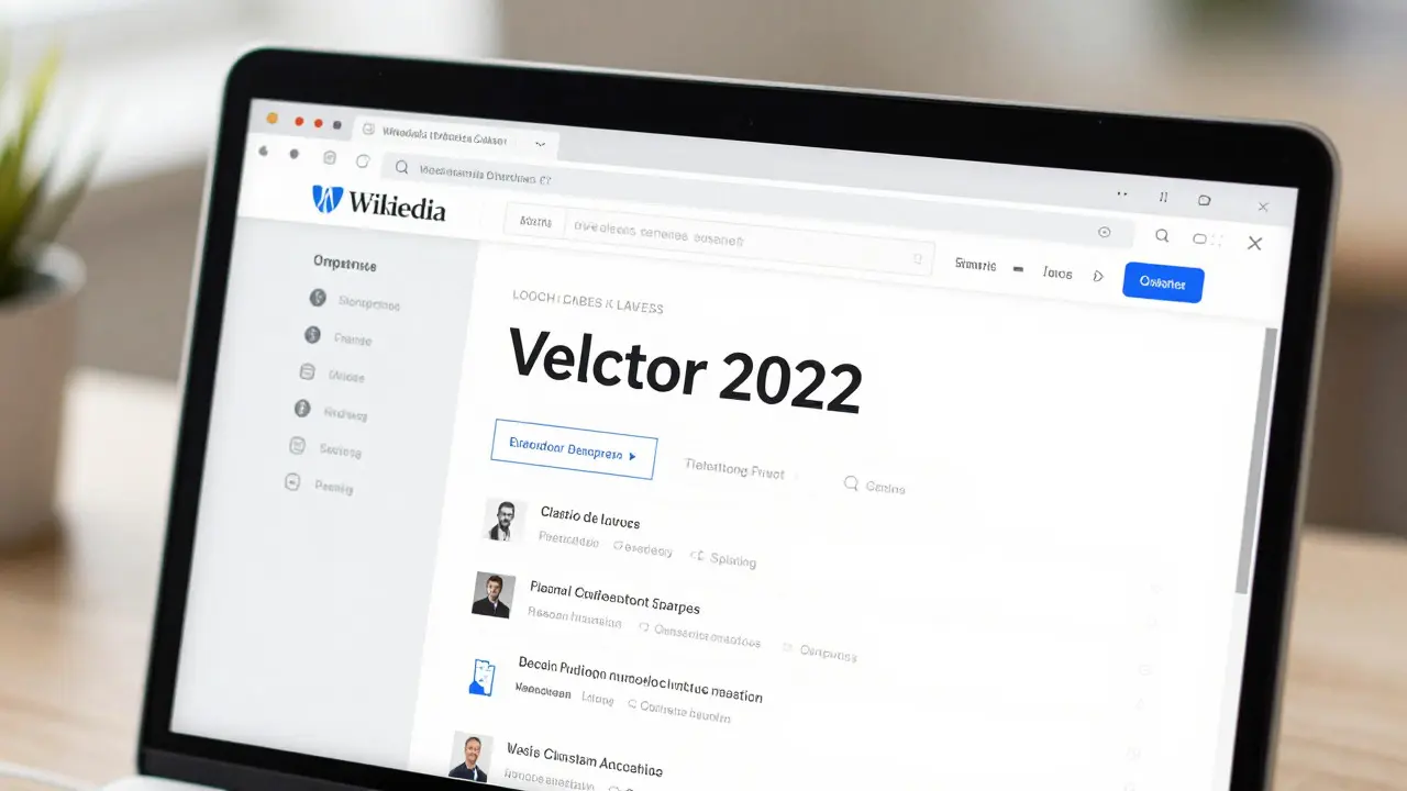
In response, the Wikimedia Foundation introduced Vector 2022, a redesigned version that moved the navigation menu to the top right corner and improved the spacing between paragraphs. This change was initially optional, allowing users to toggle between the old and new versions. But in 2024, the decision was made to make Vector 2022 the permanent default for all logged-in and anonymous users. Now, in 2026, the older "Classic Vector" option is effectively deprecated for most new accounts, though some long-time editors still retain access via specific preference settings.
Alongside this major overhaul, the concept of "skins" has evolved. In technical terms, a skin is a set of CSS styles and HTML templates that define the look and feel of the wiki. While Vector 2022 is the standard, power users can still switch to other skins like MonoBook (the very first Wikipedia skin) or Cologne Blue. However, the focus has shifted from full skin swaps to granular adjustments within the Vector framework.
Key Changes in Editing Tools and Layout
For editors, the transition has brought significant changes to the workflow. The most noticeable difference is the placement of the edit controls. In the old Vector skin, the "Edit" and "Talk" tabs were located directly above the article title. In Vector 2022, these actions are now housed in a compact toolbar at the top right of the page. This design choice aims to reduce clutter, but many veteran editors report that it takes time to retrain their muscle memory.
Another critical update involves the VisualEditor and the newer Source Editor integration. With the layout changes, the toolbars for adding images, links, and formatting text have been streamlined. The "Gadget" system, which allows users to enable extra features like syntax highlighting or table-of-contents generators, has also been updated to ensure compatibility with the new DOM structure. If you use custom gadgets, you might need to check if they've been patched for Vector 2022 support, as some older scripts broke during the migration.
- Moved Navigation: The main menu is now a hamburger icon on mobile and a dropdown on desktop, freeing up horizontal space.
- Improved Typography: Font sizes are slightly larger, and line height has increased to improve readability on both desktop and mobile.
- Simplified Edit Box: The edit interface is more focused, with fewer distractions around the text area.
- Dark Mode Support: Native dark mode is now available without needing third-party extensions, respecting system-level preferences.

User Preferences and Customization Options
One of the biggest complaints during the rollout of Vector 2022 was the lack of flexibility. Users felt locked into a single look. By 2026, however, the "Preferences" panel has become much more robust. You can now fine-tune several aspects of your experience without installing browser extensions.
Here’s what you can currently customize in your user preferences:
- Font Size: Choose between small, medium, large, or extra-large text. This is particularly useful for readers with low vision.
- Color Scheme: Select Light, Dark, or System-based themes. The dark theme is not just inverted colors; it uses softer grays to reduce eye strain.
- Layout Density: Adjust the amount of whitespace around images and tables. A "Compact" option is available for those who want to see more content per screen.
- Table of Contents Position: On long articles, you can choose whether the TOC appears at the top or floats on the side.
These settings are stored in your user account, meaning they follow you across devices. If you log in on your phone, tablet, and desktop, your preferred font size and color scheme will be consistent everywhere. This cross-device synchronization was a key requirement in the 2025 development cycle.
Impact on Mobile Users and Accessibility
A huge driver behind these changes is the fact that over 60% of Wikipedia traffic now comes from mobile devices. The old Vector skin was designed primarily for desktop browsers, leading to cramped layouts and tiny tap targets on phones. Vector 2022 addresses this by using responsive design principles. Elements resize dynamically based on screen width, ensuring that buttons are easy to tap and text remains legible without zooming.
Accessibility has also seen a major boost. The new interface adheres strictly to WCAG 2.1 AA standards. This means better contrast ratios, clearer focus indicators for keyboard navigation, and proper semantic HTML tags that screen readers can interpret correctly. For example, the search bar is now clearly labeled, and the edit button has a distinct aria-label so assistive technologies know exactly what it does. These aren't minor tweaks; they represent a fundamental commitment to making the free encyclopedia accessible to everyone, regardless of ability.
Comparison: Classic Vector vs. Vector 2022
To help you decide if you should stick with the old settings (if available) or fully embrace the new one, here’s a direct comparison of the two primary interfaces.
| Feature | Classic Vector | Vector 2022 |
|---|---|---|
| Navigation Menu Location | Left Sidebar | Top Right / Hamburger Menu |
| Default Font Size | 14px | 16px |
| Mobile Optimization | Basic Responsive | Full Touch-Optimized Layout |
| Dark Mode | Requires Extension | Built-in Preference |
| Edit Button Visibility | High (Always Visible) | Medium (In Toolbar) |
| Customization Depth | Limited | High (Font, Color, Density) |
As you can see, Vector 2022 offers more control and better performance on modern devices, while Classic Vector provides a more traditional, static experience. Most users find that after a week of adjustment, the new interface feels faster and less cluttered.
Troubleshooting Common Issues
If you're experiencing glitches after switching to the new preferences, here are a few common fixes. First, clear your browser cache. Sometimes, old CSS files from the previous skin linger and cause layout shifts. Second, check if any browser extensions, such as ad blockers or style modifiers, are interfering with the new DOM structure. Temporarily disabling them can help isolate the issue. Finally, if a specific gadget isn't working, visit the "User Gadgets" section in your preferences and try toggling it off and on again to force a reload of the script.
Remember, the goal of these changes is to make Wikipedia easier to use for a broader audience. Whether you're a casual reader or a dedicated editor, taking a moment to explore your new preference options can significantly enhance your daily interaction with the world's largest encyclopedia.
Can I revert to the old Wikipedia Vector skin?
For most new users, the option to revert to Classic Vector is no longer available in the standard preferences menu. However, long-time editors may still have access through legacy settings. If the option is missing, you can use browser extensions like 'Stylish' or 'Dark Reader' to mimic the old look, though this is not officially supported.
Does the new interface affect how edits are saved?
No, the backend saving mechanism remains the same. Whether you use the VisualEditor or the Source Editor, your changes are processed by the same MediaWiki engine. The only difference is the visual presentation of the editing tools and the preview pane.
Is dark mode on Wikipedia battery-friendly?
On OLED screens, yes. Dark mode reduces the number of pixels that need to emit light, which can extend battery life. On LCD screens, the impact is negligible. The built-in dark theme is optimized to maintain good contrast without excessive brightness.
Why did Wikipedia move the navigation menu to the top?
The primary reason is to maximize horizontal space for content, especially on tablets and laptops. The left sidebar consumed 20-30% of the screen width, pushing text too far to the right. Moving the menu to the top creates a wider, more readable column for articles.
Do my custom CSS rules still work with Vector 2022?
Mostly, yes, but you may need to update selectors. Since the HTML structure changed, some class names used in the old skin are different in Vector 2022. Check the 'Common.css' file in your user space and test your rules against the new layout to ensure they apply correctly.