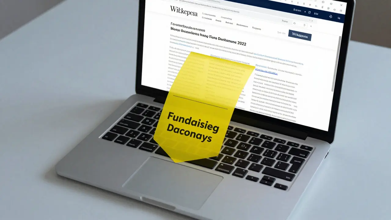
You know that moment when you’re deep in a Wikipedia article about the history of the Byzantine Empire or the mechanics of CRISPR, and suddenly, a bright yellow bar drops down at the top of your screen? It’s not an ad for shoes. It’s a plea. For decades, Wikimedia Foundation has relied on these fundraising banners to keep the servers running and the editors paid. But here’s the thing: those banners aren’t just thrown up there by someone with a marker and a dream. They are the result of rigorous, data-driven experimentation. If you think charity marketing is all about tug-at-your-heartstrings photos, you haven’t seen the spreadsheets behind Wikipedia’s money machine.
The Science Behind the Yellow Bar
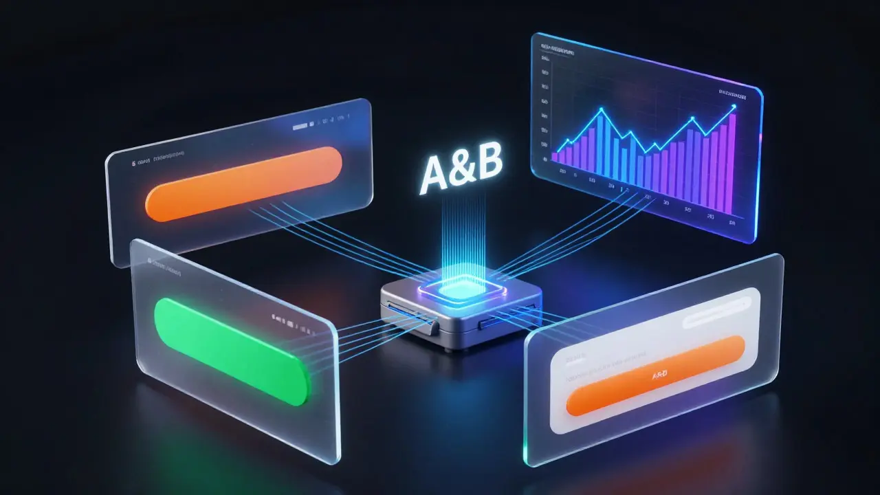
Most people assume non-profits rely on guilt. Wikipedia relies on algorithms. The foundation treats its donation pages like any other tech giant treats its landing pages. They run massive A/B tests where different versions of a banner are shown to random slices of users. One group sees a banner with a sad puppy; another sees a statistic about how much it costs to serve one page view. Another sees a simple "Donate" button with no text at all.
This isn't guesswork. It’s behavioral psychology applied to web design. The goal is simple but difficult: convert a casual reader into a donor without annoying them so much they close the tab forever. The Wikimedia Foundation tracks metrics like click-through rates (CTR), conversion rates, and average donation size. They look for statistical significance. If Version B gets 0.5% more donations than Version A, but the p-value says it could be luck, they don’t change anything. They keep testing until the data screams that one version is genuinely better.
| Variable | Variant A (Control) | Variant B (Test) | Typical Outcome |
|---|---|---|---|
| Button Color | Green | Orange | Orange often yields higher CTR due to contrast. |
| Copy Tone | Emotional Appeal | Factual/Minimalist | Factual copy often reduces "banner blindness." |
| Frequency | Every Visit | Once per Session | Lower frequency improves user retention long-term. |
| Social Proof | None | "Join 1 Million Donors" | Social proof can increase trust but may feel salesy. |
Why Simple Often Wins
You might expect the most effective banner to be the most complex. More words, more images, more emotional hooks. But on Wikipedia, less is frequently more. Readers come to Wikipedia for information, not entertainment. When a banner interrupts their flow with a three-paragraph story about a student in Kenya who used Wikipedia to pass his exams, many users tune it out. This is called banner blindness, a phenomenon where users ignore elements that resemble ads.
Tests have consistently shown that concise, direct messages perform better. A banner that simply says "Wikipedia is free. Please donate" often outperforms elaborate narratives. Why? Because it respects the user's time. It acknowledges the transaction: you get knowledge, we need money. It’s honest. And surprisingly, honesty converts. Users appreciate the transparency. They don’t want to be manipulated; they want to support something they value. When the ask is clear and low-friction, they’re more likely to click.
Consider the placement. Early experiments tried placing banners in the sidebar or at the bottom of the page. These spots were easy to scroll past. The top-of-page banner is intrusive, yes, but it guarantees visibility. The trade-off is annoyance versus exposure. Data showed that while top banners caused more immediate clicks to close, they also generated significantly more total donations. The key was timing. Showing the banner only after a user had read several articles, rather than on the first load, reduced irritation and increased the likelihood of a donation.
The Role of User Segmentation
Not all Wikipedia readers are the same. A high school student looking up homework answers has a different relationship with the site than a researcher checking citations for a paper. The Wikimedia Foundation uses segmentation to tailor experiences. New visitors might see a general introduction to why Wikipedia needs funding. Returning visitors, especially those who edit articles, might see a message acknowledging their contribution as volunteers.
This personalization extends beyond just the text. Geography matters. Donation habits vary wildly between countries. In the United States, credit card donations dominate. In parts of Europe, bank transfers are common. In India, mobile wallets are rising. A banner strategy that works in New York might flop in Mumbai. Localized language, local currency display, and preferred payment methods are tested rigorously. If a user from Brazil sees prices in USD instead of BRL, friction increases. Conversion drops. The system detects IP location and serves the appropriate variant automatically.
Device type is another critical factor. Mobile users behave differently than desktop users. On a phone, screen real estate is precious. A large banner pushes content down, requiring extra scrolling. Tests revealed that mobile-friendly banners needed to be collapsible or smaller. If the banner covered the search bar, users got frustrated. The optimal mobile banner is compact, dismissible with a single tap, and clearly indicates what happens if you click "Donate." Desktop users, with larger screens, tolerate more visual weight. They can handle a slightly larger graphic or a bit more text.
Measuring Success Beyond Dollars
It’s tempting to look only at the total amount raised. But for a non-profit like Wikipedia, cost-per-acquisition (CPA) matters just as much. If you spend $100,000 on server resources to show banners that generate $101,000 in donations, you’re barely breaking even. Efficiency is key. The foundation tracks how much each test costs to run and compares it to the incremental revenue generated.
They also measure donor retention. Getting someone to donate once is good. Getting them to donate annually is better. Some banner strategies focus on recurring gifts. A checkbox that says "Make this monthly" might lower the initial number of donors but increase the lifetime value of each donor. Tests showed that pre-checking the monthly option sometimes increased sign-ups but led to higher cancellation rates later. Unchecking it required active choice, which fostered commitment. It’s a delicate balance between ease and intent.
Another metric is the impact on reading experience. Did users stay longer? Did they visit more pages before donating? Sometimes, a highly aggressive banner causes users to leave the site entirely, never returning. That’s a loss of potential future donors. The foundation monitors bounce rates and session duration alongside donation numbers. If a banner boosts donations by 5% but increases bounce rate by 10%, it might be net negative for the ecosystem. Sustainable growth requires happy readers, not just open wallets.
Challenges and Ethical Considerations
Running experiments on millions of users brings ethical questions. Is it right to manipulate emotions for money? Wikipedia tries to avoid dark patterns-design tricks that trick users into clicking. They aim for informed consent. You know you’re being asked for money. You can easily say no. There’s no hidden subscription trap unless you opt-in.
Transparency is part of the brand. Users trust Wikipedia because it feels neutral. Aggressive marketing could erode that trust. Imagine if every article ended with a pop-up screaming "BUY NOW!" It would feel cheap. The current strategy maintains dignity. The banners are polite requests, not demands. This preserves the encyclopedia’s integrity while still securing funds. It’s a tightrope walk. Too soft, and you don’t raise enough. Too hard, and you alienate your community.
Privacy is another concern. To segment users, you need data. How much data does Wikipedia collect? They use cookies to remember if you’ve donated recently. They don’t track your browsing history across the entire web. They respect GDPR and other privacy laws. Users can opt-out of tracking. This compliance builds trust. If users felt spied on, they’d block cookies, making segmentation harder. Balancing personalization with privacy is an ongoing challenge in digital fundraising.
What’s Next for Wikipedia Fundraising?
Technology evolves, and so do testing methods. Artificial intelligence is starting to play a role. Instead of manually creating ten variants, AI can generate hundreds of combinations of text, color, and layout. Machine learning algorithms then predict which combination will perform best for specific user segments. This allows for hyper-personalization at scale. Your banner might look different from mine based on our individual interaction histories.
Video content is another frontier. Static images are safe, but short, silent videos could engage users more effectively. Early tests suggest that subtle animations draw attention without being distracting. However, video loads slower, which hurts mobile performance. Finding the sweet spot between engagement and speed is the next big test.
Finally, diversification of funding sources affects banner strategy. As Wikipedia explores partnerships and grants, the reliance on small individual donations might shift. Banners could become educational tools, explaining how donations translate into specific projects-like adding articles in underrepresented languages or improving accessibility features. Storytelling through impact reports, linked directly from banners, could deepen donor connection.
How often does Wikipedia change its fundraising banners?
Wikipedia doesn't stick to one static banner year-round. They run continuous A/B tests, meaning multiple versions are live simultaneously for different user groups. Successful variants may run for weeks or months during peak fundraising seasons, typically November and December, while others are rotated out quickly if they underperform. The changes are dynamic and data-driven, not scheduled arbitrarily.
Do I get fewer banners if I donate?
Yes. Once you make a donation, the system places a cookie on your browser indicating you've contributed. For a set period (usually a year), you won't see fundraising banners. This prevents donor fatigue and shows appreciation for your support. If you clear your cookies or use incognito mode, you might see the banners again, as the site no longer recognizes your previous donation status.
Why do some users see different banners than others?
This is due to segmentation and A/B testing. Factors like your geographic location, device type (mobile vs. desktop), browser language, and whether you're a new or returning visitor determine which banner you see. Additionally, you are randomly assigned to a test group to help the Wikimedia Foundation gather statistically significant data on what messaging works best.
Are Wikipedia fundraising banners considered advertisements?
No, they are not commercial advertisements. They are internal calls-to-action for a non-profit organization. Unlike ads, which sell third-party products, these banners promote the organization itself. Wikipedia remains ad-free to maintain neutrality and user trust. The banners are strictly related to sustaining the platform's operations and mission.
How much of my donation goes to actual content creation?
The majority of donations go toward technical infrastructure, such as servers and bandwidth, which are necessary to deliver content to billions of users. While editors are volunteers, the staff supports software development, community outreach, and legal protections. Specific breakdowns are published in annual financial reports, showing that operational costs are kept relatively low compared to traditional media companies.